
UK money trends still suggesting downside risk
 Simon Ward
 1 Comment
UK real money contraction warned of 2022 economic stagnation and 2023 recession. Weakness has abated but real money measures have yet to resume expansion, casting doubt on hopes of a sustainable economic recovery.
The latest ONS numbers are consistent with a recession having started in Q2 2023. Among key features of the GDP release:
-
Gross value added (GVA) at basic prices peaked in Q1 2023, falling by 0.03% in Q2, 0.16% in Q3 and 0.34% in Q4.
-
The cumulative decline in GVA / GDP of 0.5% between Q2 and Q4 is inconsistent with a description of the economy as “flatlining”.
-
Similarly, claims that the consumer has been holding up are no longer tenable given a 1.0% cumulative contraction in household consumption between Q2 and Q4.
-
GDP / GVA fell by 0.2% and 0.3% respectively in the year to Q4, meeting a stronger recession definition than the two-quarter rule (in contrast to Japanese GDP also released today).
-
Nominal as well as real GDP fell in Q4, with the GDP deflator rising at a 2.0% annualised pace between Q2 and Q4.
The suggestion of cyclical peak in Q1 2023 is supported by the LFS employment measure, which reached a high in the three-month period centred on March. (The LFS aggregate is 10% larger than the PAYE employment series, reflecting coverage of self-employment.) Aggregate hours worked also peaked then, falling 1.5% through November.
Real money measures began to contract in H2 2021. GDP stagnated from Q2 2022, consistent with the usual lag. The six-month rates of decline of real narrow and broad money reached a peak in March 2023, warning of H2 economic contraction – see chart 1.
Chart 1
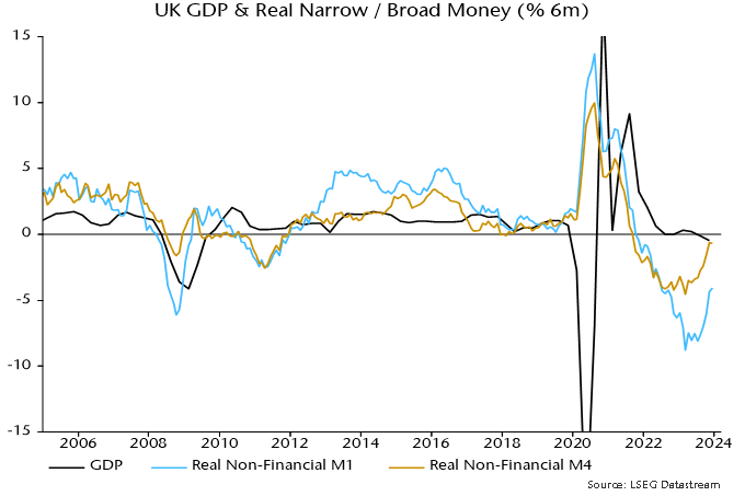
Six-month real money momentum has recovered significantly but has yet to turn positive. Slowing inflation has been a key driver, while nominal broad money is no longer contracting. Economic weakness may abate in H1 2024 but current monetary trends appear inconsistent with a meaningful recovery. Early rate cuts are urgently required to limit still-significant downside risk and head off an extended inflation undershoot.
Will "Treasury QT" sink markets?
Recent US equity market buoyancy is likely to be related to a rebound in broad money momentum during H2 2023. The previous post argued that this was driven by monetary financing of the federal deficit – specifically, large-scale issuance of Treasury bills that were bought mainly by money funds and banks.
A more contentious interpretation is that the Treasury has been operating a form of QE that has overridden the monetary effects of the Fed’s QT.
The federal deficit can be financed by running down the Treasury’s cash balance at the Fed or issuing bills / coupon debt. The first option injects money directly. Issuing bills is also likely to expand broad money, since money funds and banks usually absorb the bulk of new supply. Coupon issuance usually has the smallest monetary impact because coupon debt is purchased mainly by non-banks.
So a summary measure of the monetary influence of financing operations is the difference between Treasury bill issuance and the change in the Treasury balance at the Fed – henceforth “Treasury QE”.
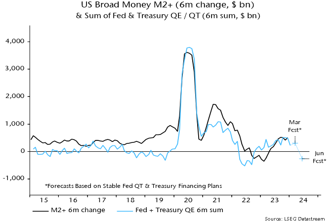
Chart 1 shows six-month running totals of Fed QE / QT and the suggested Treasury monetary impact along with the six-month change in broad money. The sum of the Fed and Treasury series “explains” most of the variation in money momentum in recent years – chart 2.
Chart 1
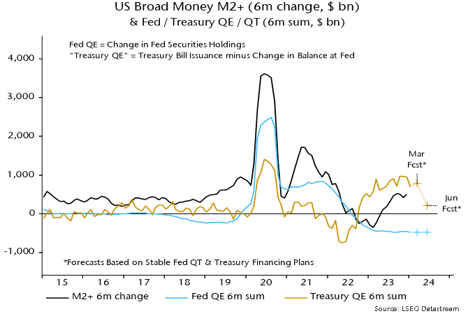 Chart 2
“Treasury QE” was a major contributor to the 2020 monetary surge and became significant again in late 2022 / early 2023, mainly reflecting a run-down of the Treasury’s cash balance. Following suspension of the debt ceiling in June 2023, the Treasury rebuilt the balance but the monetary impact was more than offset by bumper bill issuance – see the previous post for details.
The Treasury’s recently released financing plans imply a swing from expansion to contraction during H1 2024. The cash balance at the Fed is targeted to fall from $769 billion at end-2023 to $750 billion at end-Q1, remaining at this level at end-Q2. The stock of bills, meanwhile, is projected to rise by $442 billion in Q1 but fall by $245 billion in Q2. “Treasury QE” would remain strong at $461 billion in Q1 – far ahead of expected Fed QT of about $240 billion – but a dramatic shift would occur in Q2, with “QT” of $245 billion.
If Fed QT were to continue at its current pace, the suggestion is that the six-month change in broad money would return to negative territory by mid-year, unless other monetary counterparts were to show offsetting strength – chart 2.
Note that the above argument is distinct from the notion that ongoing Fed QT risks pushing reserve balances and / or deposits at the overnight reverse repo (ON RRP) facility below the level required for money market stability. The possibility of a broad money shortage due to a withdrawal of Treasury monetary support would remain even if the minimum reserves / ON RRP level proves to be lower than feared. The two risks, however, could interact.
A possible conclusion is that markets face a monetary air pocket in Q2 unless the Fed halts QT at its March meeting. A cynic might speculate that the Treasury’s financing plans are designed to increase pressure for an early Fed cessation, which might be followed by a H2 resumption of bill financing to swell monetary support ahead of the November election.
Why has US money growth recovered?
The six-month rate of change of US broad money has recovered from negative territory in early 2023 to 3.9% annualised in December – close to an average of 4.2% over 2010-19, when economic performance was generally favourable.
Does this signal that the economy has adjusted to higher interest rates and monetary conditions are no longer particularly restrictive, in turn suggesting less need for Fed easing?
The analysis below of the “credit counterparts” to monetary expansion indicates that the recent revival has been driven by exceptionally large-scale purchases of Treasury bills by money market funds.
Such buying will fall back but its recent importance highlights a larger point. If the fiscal deficit remains at its current level (or rises further), and the Treasury chooses to fund a large proportion of the deficit by expanding the Treasury bill issue, the contribution of deficit financing to monetary growth is likely to be significant, even assuming no return to QE. In this scenario, a higher average level of interest rates may be necessary to constrain money growth to a pace – of perhaps 4-5% pa – compatible with trend economic expansion and on-target inflation.
On the suggestion that the recovery in money growth obviates the need for policy easing, a key point is that the effects of prior monetary restriction are still feeding through and may not be fully apparent for another year or more. Rate cuts are likely to be warranted to cushion near-term economic weakness and avert an inflation undershoot.
The numbers quoted above for US broad money expansion refer to the “M2+” measure calculated here, which adds large time deposits at commercial banks and institutional money funds to the official M2 aggregate. The inclusion of these items is important as they capture a significant proportion of money holdings of non-financial businesses and non-bank financial institutions. As previously discussed, US business money holdings have been rising rapidly in recent quarters, resulting in six-month momentum of M2+ diverging positively from that of M2 since late 2022, i.e. M2 is understating broad money growth at present.
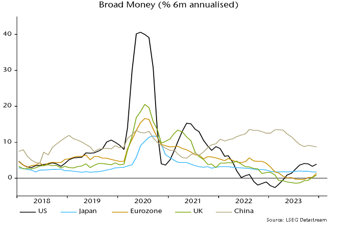
Six-month broad money momentum has recovered by much more and to a higher level in the US than in the Eurozone and UK – see chart 1.
Chart 1
The credit counterparts analysis links changes in broad money to movements in other items on the monetary sector’s balance sheet, the US monetary sector being defined as the Fed, commercial banks and other depository institutions, and money funds. The following simple formulation is used for the analysis here:
Change in broad money = monetary financing of federal deficit + change in commercial banks’ loans and leases + other counterparts (residual)
Monetary financing of federal deficit = net purchases of Treasury securities by Fed, commercial banks and money funds – change in Treasury general account balance at Fed
The table shows the contribution of these items to the six-month change in M2+, not annualised, in December 2022 and December 2023.
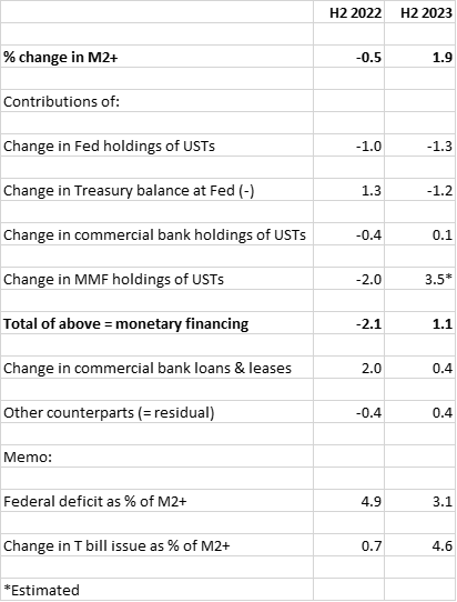
The positive swing in six-month momentum between the two periods was driven by monetary deficit financing and, in particular, a huge change in money funds’ transactions in Treasuries, from selling in H2 2022 to exceptionally large-scale buying in H2 2023.
What caused this turnaround? Following the suspension of the debt ceiling in June 2023, the Treasury issued a net $1.21 trillion of Treasury bills in H2 2023, up from $170 billion in H2 2022 and the second-highest half-year amount ever (after H1 2020).
Money funds and commercial banks are natural buyers of Treasury bills because of the maturity structure of their liabilities. The market mechanism that induced them to increase demand was a rise in Treasury bill yields relative to other short-term rates, including the emergence of a premium over the Fed’s overnight reverse repo rate.
Money funds moved $1.1 trillion out of the Fed facility during H2 2023, buying an estimated $900 billion of Treasury securities and placing the remainder (and an additional amount) in the private repo market (with those funds probably also used to buy Treasuries, suggesting further indirect monetary financing).
Money funds’ Treasury buying is likely to slow dramatically in H1 2024, for two reasons. First, expansion of the Treasury bill issue will be scaled back to $200 billion (from $1.21 trillion in H2 2023), according to borrowing plans. Secondly, money funds’ balance in the Fed facility was down to $800 billion at end-2023 (from $2.3 trillion a year earlier), with a further decline in early 2024. The rate of Treasury bill purchases will plausibly slow as the balance approaches exhaustion.
It would, however, be misleading to suggest that purchases of Treasuries by money funds and banks face a constraint in terms of the availability of investible resources. The first-round effect of the fiscal deficit is to swell the broad money stock, i.e. it creates the liquidity necessary to absorb associated debt issuance. If new Treasuries are sold to non-banks, the monetary boost is reversed. If, alternatively, money-holders choose to retain their higher balances, banks and money funds have additional funds with which to buy Treasuries. The money creation due to the deficit then remains unsterilised.
How large a boost could this private form of monetary financing give to broad money growth over the medium term? The federal deficit was $1.78 trillion in calendar 2023, equivalent to 6.5% of GDP and 6.8% of the M2+ stock at end-2022. Suppose that 1) the deficit remains stable as a proportion of the money stock, 2) it is half-financed via Treasury bills and 3) money funds and banks take up half of the issued bills. Assuming no QE / QT and a stable Treasury balance at the Fed, monetary deficit financing would contribute 1.7 pp to annual M2+ growth.
For comparison, Treasury buying by money funds and banks contributed 0.6 pp to average annual growth of M2+ over 2010-19.
Suggested conclusions are: 1) prior monetary weakness will be the dominant influence on economic developments over the next few quarters; 2) the recovery in broad money growth is likely to stall in H1 2024; and 3) a persistent large fiscal deficit could cause funding indigestion and force a renewed increase in reliance on bill financing (or, in the extreme, a resumption of QE), in turn posing an upside risk to medium-term money growth and inflation.
What explains US consumer exceptionalism?
US consumers have trounced the Europeans – again. US personal consumption rose by 9.7% between Q4 2019 and Q3 2023 versus a 0.5% increase in the Eurozone and a 1.6% fall in the UK – see chart 1.
Chart 1
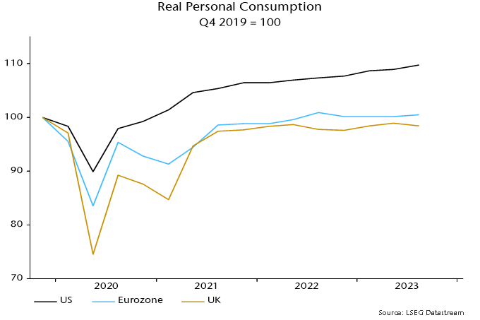
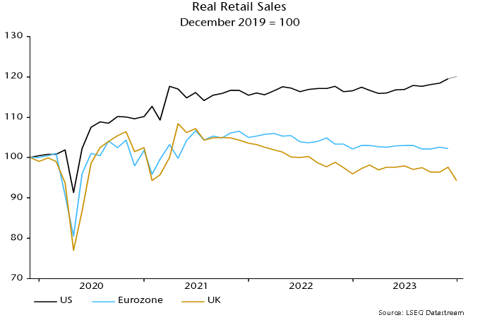
The divergence probably widened in Q4, judging from retail sales. US sales rose solidly into year-end as Eurozone turnover flatlined (through November) and UK sales hit a new low – chart 2.
Chart 2
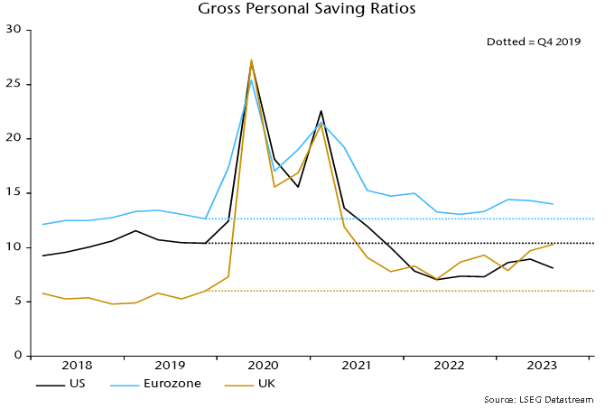
Faster growth of US real personal disposable income explains just over half of the US / Eurozone consumption divergence over Q4 2019-Q3 2023 and about one-third of the US / UK difference. The remainder reflects contrasting saving behaviour.
The US personal saving rate fell by 2.3 pp between Q4 2019 and Q3 2023 versus rises of 1.4 and 4.3 pp in the Eurozone and UK respectively – chart 3*.
Chart 3
What explains the willingness of US households to consume more out of their income than before the pandemic, both in absolute terms and relative to Europeans?
A “monetarist” view is that divergent saving behaviour is related to the magnitude of the boost to household money balances from pandemic-era monetary and fiscal stimulus.
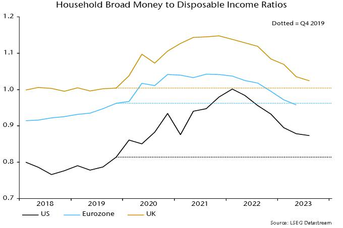
The rise in the ratio of household broad money to disposable income from Q4 2019 was larger and peaked later in the US than in the Eurozone and UK – chart 4.
Chart 4
Households with “excess” money balances adjust by spending more on consumption or investment (housing), adding to non-monetary financial assets and / or reducing debt. The larger US excess has probably resulted in a bigger and more sustained boost to consumption than in Europe.
To the extent that monetary adjustment involves higher consumption, the saving rate will be lower than otherwise until the ratio of money balances to income is restored to an “equilibrium” level.
Judging how much of a consumption boost remains requires an estimate of “equilibrium”. As chart 4 shows, the ratio of household broad money to income is below its Q4 2019 level in the Eurozone but still higher in the US and, to a lesser extent, UK.
A superior approach, however, may be to compare money to income ratios with their pre-pandemic trends, since the ratios tend to rise over time as wealth grows faster than income.
On this basis, money demand may now be acting to restrain consumption in the Eurozone / UK, while US excess money balances are now modest and on course to be removed during 2024 – chart 5.
Chart 5
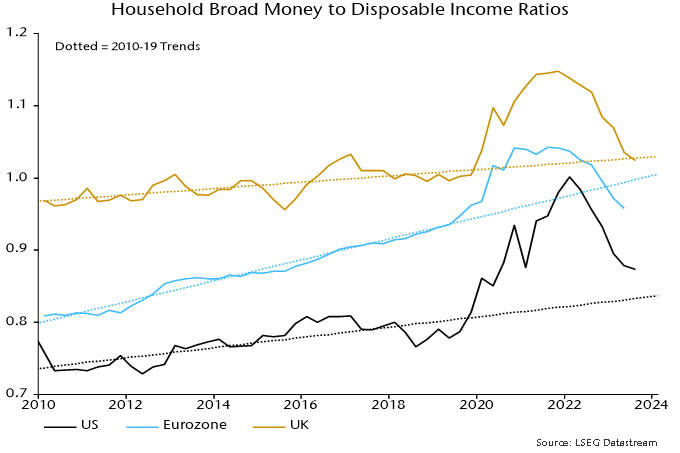
The US money to income ratio peaked in Q1 2022, a quarter ahead of the low in the saving rate. The saving rate had risen by 1 pp by Q3 2023 and may increase further as the excess money effect wanes.
*The headline measure of the US personal saving rate is calculated net of depreciation. A gross measure is used here to align with European convention.
Chinese money trends signalling still-worsening prospects
China’s economic woes partly reflect restrictive monetary policy. The latest money numbers suggest still-deteriorating prospects and urgent need for a policy reversal. It is unclear whether such a pivot is under way.
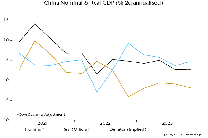
Two-quarter growth of nominal GDP (own seasonal adjustment) remained historically weak at 2.7% annualised in Q4, after 2.6% in Q3. Official real GDP numbers show a recovery in two-quarter growth from 3.6% annualised to 4.7%, so the implication is that GDP prices fell at a faster rate (1.9% annualised versus 1.0%) – see chart 1.
Chart 1
The stabilisation of two-quarter nominal GDP growth in H2 2023 mirrors sideways movement of six-month narrow and broad money growth during H1. Money trends, however, weakened sharply during H2, suggesting a further slowdown in nominal / real GDP in H1 2024 – chart 2.
Chart 2
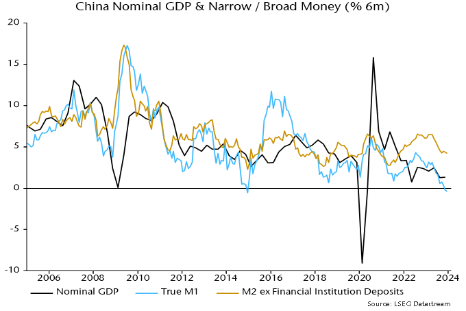
Six-month narrow money momentum turned negative in late 2023 and is challenging the record low reached at end-2014. Weakness then rang policy alarm bells, contributing to an aggressive easing shift in 2015 that succeeded in reflating the economy and stocks.
Monetary optimists note that broad money growth is above the level reached then and in the middle of its range in recent years. A widening narrow / broad money divergence, however, suggests a faster rate of decline of broad money velocity, plausibly related to structural weakness in real estate and lack of confidence in policy.
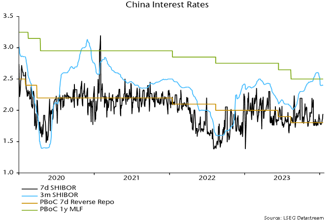
Will the economy and markets be rescued by 2015-style easing? Developments in 2023 don’t inspire hope. The PBoC loosened policy during H1 but a new upswing in term money rates began soon after the appointment of new Governor Pan Gongsheng in July, with three-month SHIBOR closing 2023 at a 32-month high – chart 3.
Chart 3
Another change under Governor Pan has been the suspension of publication of the PBoC’s informative quarterly surveys of entrepreneurs, consumers and bankers – the Q3 surveys were never released and Q4 results would normally have appeared by now.
A possible interpretation is that the PBoC has switched to prioritising currency stability, managing rates higher to discourage capital outflows while passing the baton of economic support to fiscal policy (and withdrawing from providing information on economic developments).
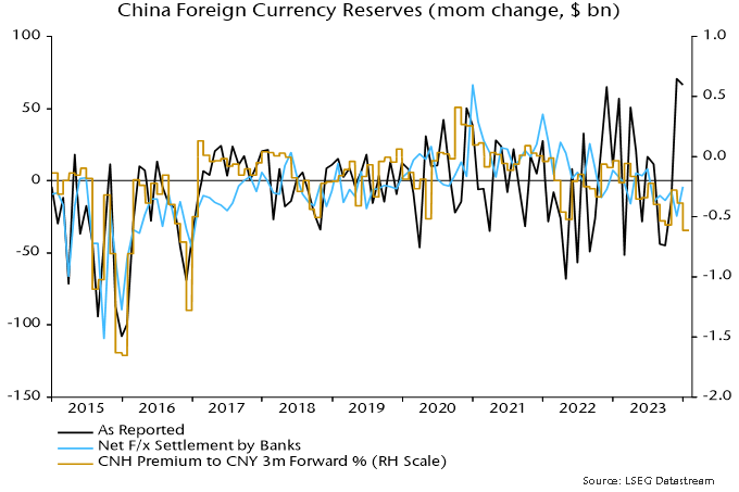
Foreign exchange reserves were boosted by valuation effects in late 2023 (weaker US dollar, rally in Treasuries) but settlements data suggest sustained intervention to support the currency during H2, consistent with a persistent sizeable forward discount on the offshore RMB – chart 4.
Chart 4
Fiscal stimulus focused on government-directed investment is unlikely to be sufficient to reverse economic weakness without accompanying monetary accommodation to lift private sector confidence and broad money velocity.
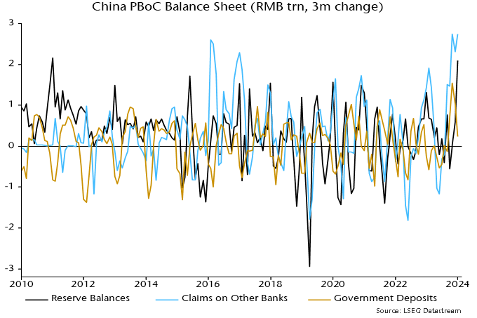
Are there any signs of the PBoC pivoting back to easing? One glimmer is that its lending to the banking system continued to expand rapidly in late 2023, which, together with a slower rise in government deposits at the PBoC, resulted in the second-largest quarterly rise in bank reserves on record – chart 5.
Chart 5
The PBoC’s injections, however, may have been intended to moderate rather than reverse the rise in money rates. Three-month SHIBOR eased in early January but has stalled since – chart 3. Recent renewed US dollar strength may bolster the hard-liners.