A "monetarist" perspective on current equity markets
 Simon Ward
 Post a Comment
The quarterly commentary in mid-2023 noted that the cycle and monetary analyses were giving conflicting signals. The stockbuilding cycle appeared to be tracing out a low, a development usually associated with stronger performance of equities and other cyclical assets. However, greater weight was accorded to continued weakness in global real narrow money momentum, which suggested downside risk to economic activity and insufficient liquidity to support market gains.
The cycle signal has so far proved the correct one, with cyclical assets rallying strongly over the past five months. Monetary conditions have been more permissive than expected, probably reflecting continued deployment of “excess” money balances left over from the 2020-21 monetary surge, as well as unusual US deficit-financing operations.
What now? Valuations of some cyclical assets appear already to discount a solid and sustained economic upswing. Global real narrow money momentum has recovered slightly but remains negative, while the level of money balances may now be below “equilibrium”. Until money growth normalises, the risk is that an initial stockbuilding cycle recovery will prove disappointingly weak or even fail, with a retest of the 2023 low. A monetary revival, meanwhile, may have been pushed back by major central banks’ caution in reversing 2022-23 policy restriction, although an easing trend is under way in EM.
Commentaries in 2022 argued that the stockbuilding cycle was likely to bottom in 2023, probably in H2, based on the cycle’s 3.33-year average length and the prior low having occurred in Q2 2020. The possibility of an earlier trough was considered, on the view that the current cycle could be shorter than average to compensate for a longer prior cycle (4.25 years).
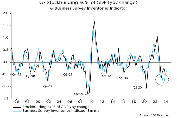
The key indicator used to monitor the cycle – the annual change in the stockbuilding share of G7 GDP – appears to have reached a major low in Q1 2023. A secondary indicator based on business surveys confirmed this trough in July – see chart 1.
Chart 1
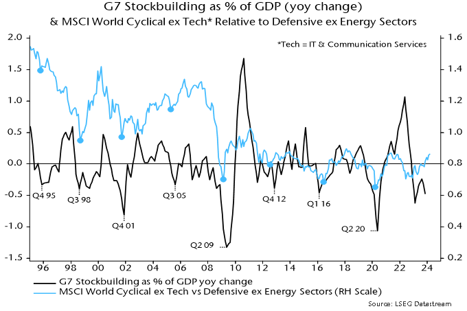
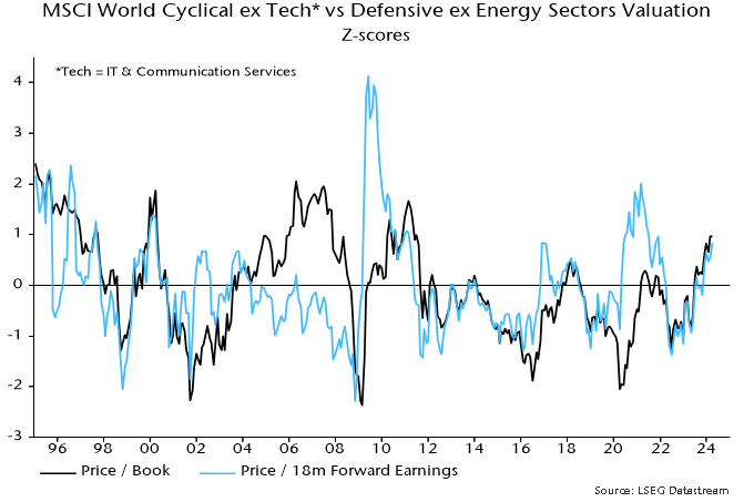
Stockbuilding cycle lows historically were usually associated with nearby major or minor lows in cyclical asset prices. Chart 2 shows the relationship with the relative performance of equity market cyclical sectors, excluding IT and communication services. A cyclical rally gathered pace from April 2023, consistent with a H1 cycle trough.
Chart 2
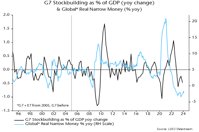
Why was a scenario anticipated in 2022 sadly underplayed in commentaries last year? The difficulty was that stockbuilding cycle lows historically were preceded by an upturn in global real narrow money momentum – chart 3. A marginal recovery in annual momentum occurred between February and June last year but a relapse to a lower low ensued. With no monetary improvement, and major central banks continuing to tighten into H2, it seemed unlikely that economic news and fund flows would support outperformance of cyclical assets.
Chart 3
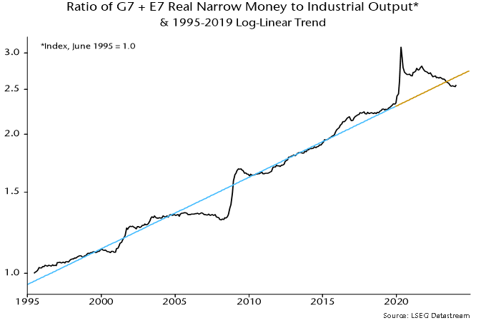
One explanation for the disconnect is that real money momentum, while a reliable indicator historically, failed to capture the availability of money to support activity and markets because of an overhang of “excess” balances created by earlier monetary strength. The ratio of the stock of global real narrow money to industrial output at end-2022 was still 4% above its steeply rising pre-pandemic trend – chart 4.
Chart 4
The strength of US equities may also have partly reflected the US Treasury’s decision, following the suspension of the debt ceiling in June, to “overfund” the federal deficit via issuance of bills, which were purchased mainly by money-creating institutions. This had the effect of more than offsetting the monetary drag from the Fed’s QT, while low coupon issuance created space in investors’ portfolios for additional purchases of credit and equities.
Support from these influences should be at or close to an end. The ratio of global real narrow money to industrial output returned to its March 2020 level in mid-2023, moving sideways since and now 4% below the pre-pandemic trend – chart 4. The Treasury’s financing plans, meanwhile, envisage a reduction in the bill float in Q2, raising the possibility of renewed monetary US weakness unless the Fed swiftly tapers QT.
Global real narrow money momentum has firmed again since Q3 2023 but remains negative, in both annual and six-month terms. A revival could, in theory, continue even if major central banks delay policy easing: rising economic confidence could be reflected in a switch out of time deposits and money funds into demand / overnight deposits, while EM money trends may improve further in response to recent policy easing. More likely, a normalisation of money growth will require a significant reversal of 2022-23 DM policy rate hikes.
Without a further rise in real money momentum, the initial stockbuilding cycle recovery may prove disappointingly limp or even fizzle altogether, revisiting the H1 2023 low. Such a scenario would pose a major risk to some cyclical assets now apparently discounting solid / sustained economic growth, such as the DM cyclical equities sector basket – chart 5.
Chart 5
How could investors sharing the latter concern and favouring a defensive bias hedge against the possibility that a stockbuilding cycle upswing unfolds normally, implying economic acceleration into 2025? Some cyclical assets have lagged, including industrial commodity prices, the DM materials sector and EM cyclical sectors, which – unlike in DM – are at a low valuation versus defensive sectors relative to history.
Chart 6 shows six-month real narrow money momentum in major countries. The US remains above Europe but the gap has narrowed, while, as argued above, the US recovery could go into reverse into Q2. The UK, meanwhile, has crossed above the Eurozone, suggesting improving relative economic prospects following GDP underperformance in the year to Q4.
Chart 6
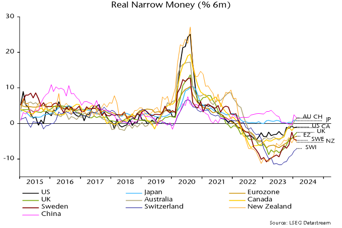
China was a significant contributor to the recent rise in global real narrow money momentum, following record PBoC lending to banks in Q4. Such lending, however, contracted in January / February and a decline in term money rates has stalled, raising concern that the recovery in money growth will falter.
Other notable features include a pick-up in Australia, continued relative weakness in Switzerland and a relapse in Sweden. The suggestion is that the Australian economy will outperform, delaying rate cuts; by contrast, the Swiss National Bank has already embarked on easing, with the Riksbank expected to follow in Q2.
G7 inflation has continued to moderate in line with a simplistic monetarist forecast based on the profile of broad money growth two years earlier. A note in November 2022 suggested that annual consumer price inflation (GDP-weighted average), then at 7.8%, would fall below 3% by December 2023. The latest reading, for February, was 2.9%.
US annual core inflation on the Fed’s favoured PCE measure was 2.8% in February or 2.2% excluding lagging rents. Market concerns about inflation remaining “stubborn” are based on a rebound in shorter-term momentum measures but this has been mainly due to an outsized January gain, possibly reflecting residual seasonality (which could also explain unexpected weakness in late 2023), i.e. these measures are likely to fall back sharply as the January effect drops out.
G7 annual broad money growth continued to decline into April 2023, suggesting that the primary inflation trend will remain down into H1 2025. The reduction to date, however, was accelerated by post-pandemic normalisation of supply chains and weakness in commodity prices – the former effect is over and commodity prices usually rise during stockbuilding cycle upswings. The baseline view here remains that inflation rates will return to target by H2 2024 with significant risk of a subsequent overshoot and no sustained rebound before H2 2025.
What do US money trends suggest about "neutral" rates?
US economic “resilience” in 2023, recent inflation stabilisation and buoyant risk asset markets raise the question of whether the current level of policy rates is restrictive.
A “neutral” level of rates, according to the monetarist view, is one that results in monetary growth consistent with target inflation. Based on 2010s experience, US broad money expansion of about 5% pa could reasonably be expected to yield medium-term inflation of 2%. (“Broad money” here refers to an expanded M2 measure – “M2+” – incorporating large time deposits at commercial banks and institutional money funds.)
The six-month rate of change of broad money recovered from negative territory in early 2023 to 3.7% annualised in January, remaining at this level in February – see chart 1. This might be taken to suggest that the economy is adjusting to the higher level of rates and the current deviation from “neutral” is modest.
Chart 1
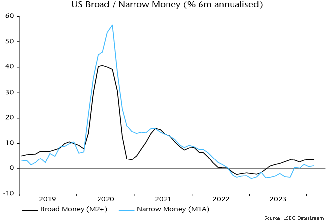
Money growth over the past year, however, was boosted by unusual deficit financing operations, which more than offset monetary destruction due to the Fed’s QT. The Treasury’s plans to scale back bill issuance imply a sharp reversal in Q2, as previously discussed.
Put differently, the “neutral” level of rates may have been temporarily lifted by the Treasury’s financing operations but a relapse is now likely.
Could a recovery in bank lending offset a near-term drag on money growth from less expansionary Treasury operations and ongoing QT? Six-month growth of commercial bank loans appears to have bottomed in late 2023 but was only 2.1% annualised in February, while the last Fed loan officer survey remained downbeat – chart 2.
Chart 2
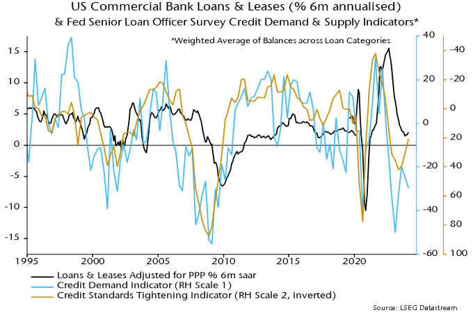
The suggestion that “neutral” is significantly lower than the current level of policy rates is supported by narrow money trends. (“Narrow money” = M1A = currency in circulation plus demand deposits.) Six-month momentum also recovered during 2023 but peaked at only 1.7% annualised in December, easing to 1.2% in February – chart 1.
Narrow money may be re-entering contraction – monthly changes were negative in January and February.
The latest US data support concern that a minor recovery in global six-month real narrow money momentum is about to go into reverse.
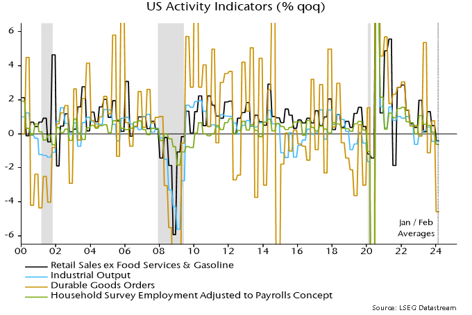
Meanwhile, weakness in US “hard” economic data for January / February has, perhaps, received less attention than it deserves. Average levels of retail sales, industrial production, durable goods orders and household survey employment were lower than in Q4 – chart 3. March data could change the story but joint quarterly declines were historically characteristic of recessions.
Chart 3
Global monetary update: minor recovery stalling?
Global six-month real narrow money momentum – a key leading indicator in the forecasting approach employed here – has recovered from a low in September 2023 but remains negative and could be stalling. Allowing for the typical lead, this suggests a slide in economic momentum into mid-year with limited subsequent revival.
Monetary trends, therefore, cast doubt on the current market consensus view that a global cyclical upswing is under way.
The real money / economic momentum relationship is primarily directional, i.e. involving turning points rather than levels. Chart 1 highlights related troughs in six-month rates of change of global (i.e. G7 plus E7) real narrow money and industrial output since 2000. The average lead time at these lows was eight months, with a range of four to 14.
Chart 1
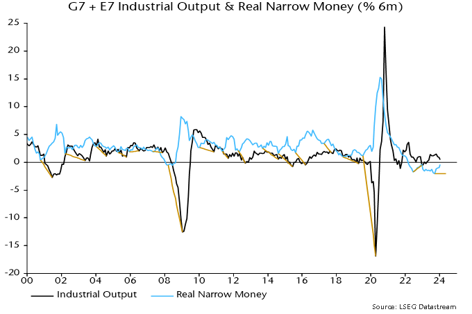
So the September 2023 low in real money momentum could be associated with an output momentum low any time between January and December 2024.
The directional relationship was briefly disrupted during the pandemic but has since been reestablished: a trough in real money momentum in June 2022 was followed by an output momentum low in December 2022, with subsequent peaks in December 2022 and October 2023 respectively.
Six-month output growth in January was the slowest since May.
While the directional relationship is intact, output momentum in 2022-23 was much stronger than suggested by prior levels of real money momentum. As previously discussed, this is probably attributable to a monetary “overhang” from rapid growth in 2020-21. The ratio of the stock of global real narrow money to industrial output returned to its March 2020 level in September last year and has since moved sideways, arguing for a normalisation of the levels relationship of real money and economic momentum.
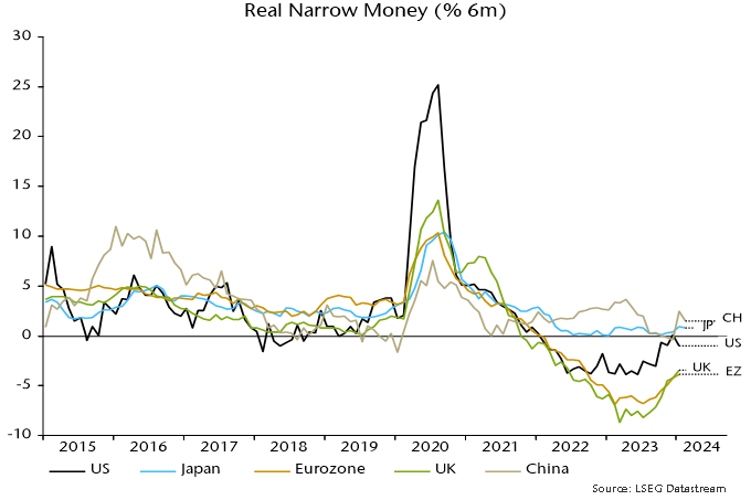
The recovery in real money momentum between September 2023 and January 2024 was broadly based across countries but the US pick-up reversed in January – see previous post – while Chinese / Japanese momentum declined in February – chart 2. So the global revival could be stalling with momentum still negative. (A February update will be provided following release of US / Eurozone monetary data next week.)
Chart 2
How do monetary signals compare with messages from the yield curve?
Chart 3 shows a longer-term history of six-month rates of change of global industrial output and real narrow money, along with the differential between GDP-weighted averages of 10-year government bond yields and three-month money rates. (The chart splices together G7 data through 2004 with subsequent G7 plus E7 numbers.)
Chart 3
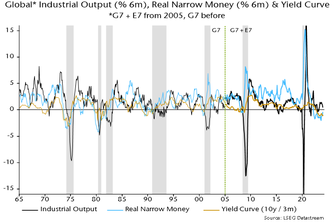
The directional leading relationship between real money and economic momentum is equally convincing pre-2000, with a similar average lead time.
The yield curve has broadly mirrored trends in real money momentum, with a slight tendency for money to lead. However, the curve predicted fewer output momentum turning points, particularly in recent years, i.e. monetary signals have been more informative and reliable.
Continued yield curve inversion is consistent with still-negative real money momentum. An increase in inversion since October, moreover, contrasts with the recent monetary recovery, supporting concern that the latter may be stalling.
Combinations of negative real money momentum and an inverted curve were always followed by global recessions. The longest interval between a joint signal and recession onset was in 1989-90: real money momentum and the yield curve were both negative in April 1989, with a recession judged to have started in November 1990*.
The most recent joint signal occurred in October 2022, when the yield curve moved into inversion. Based on history, a recession would be expected by May 2024 at the latest. Are markets premature in sounding the all-clear? Assuming no downturn through May, should the signal be disregarded? Do I feel lucky?
*The recession bands in the chart begin when the six-month change in industrial output turns negative ahead of a fall to below -1.25% (not annualised).
Why UK payrolls data could be misleading economy bulls
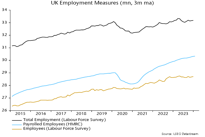
Perceptions of UK labour market “resilience” rest partly on continued growth in the payrolled employees series, based on PAYE data. This series, however, is likely to have been boosted by a rise in the proportion of self-employed people included in PAYE.
Labour Force Survey (LFS) employment is, at least in concept, the most comprehensive measure of employed people, including all employees and self-employed. The payrolled employees series covers most employees* along with self-employed people who receive pay through PAYE. The latter group includes business owners who choose to draw a salary, contractors on the payroll of the client and self-employed people with second jobs as employees.
LFS employment peaked in the three months to April 2023, standing 150,000 below that level in the three months to January. This is consistent with GDP / gross value added data indicating a recession starting in Q2 2023.
The payrolled employees series, by contrast, grew by 270,000 over the same interval.
This continues a longer-term divergence. LFS employment in the latest three months was 85,000 above its pre-pandemic peak, reached in the three months to February 2020. Payrolled employees have increased by 1.3 million since then – see chart 1.
Chart 1
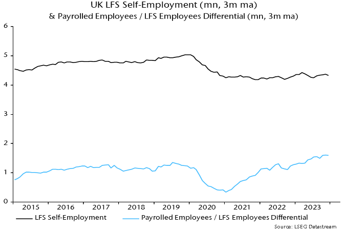
There are two reasons for suspecting that the payrolled employees series has been swollen by increased PAYE coverage of the self-employed. First, reform of IR35 rules in the private sector in April 2021 are likely to have resulted in some contractors being moved onto clients’ payrolls.
Secondly, the number of employee jobs has risen by more than employee numbers, suggesting a rise in multiple job-holding**. This may have resulted in some people identifying as self-employed in the LFS being picked up in PAYE.
LFS self-employment was 4.33 million in the three months to January. A rough guide to the number included in PAYE is the difference between the payrolled employees series and the LFS measure of employees – 1.6 million.
Chart 2 shows that the latter differential mirrored changes in LFS self-employment until early 2021. It then embarked on a rising trend while LFS self-employment moved sideways. The timing is consistent with an impact from the IR35 reform.
Chart 2
The rise in the payrolled employees / LFS employees differential is unlikely to be solely attributable to increased PAYE coverage of the self-employed. The decline in quality of LFS data due to a falling response rate may have been associated with underrecording of growth in employee numbers.
The payrolled employees series, nevertheless, warrants a health warning and its relative strength should be at least partly discounted, particularly as it jars with other evidence including an ongoing fall in vacancies, rising claimant unemployment, weak REC jobs reports and a recent increase in redundancies.
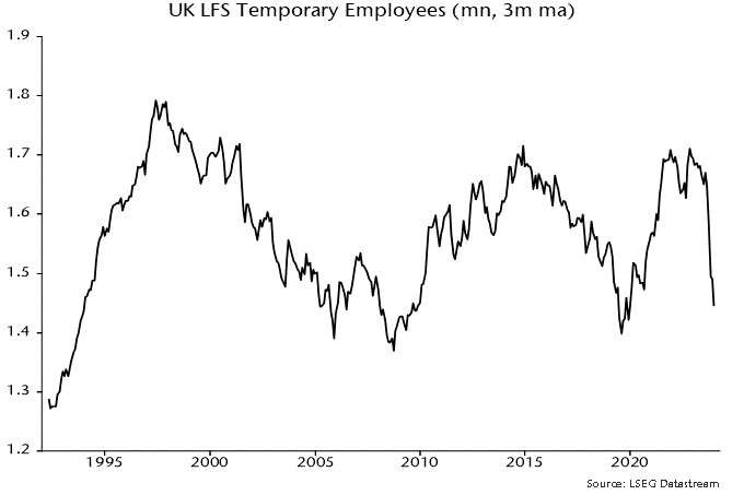
Addendum: Falling US temporary help services employment has been a harbinger of weakness in aggregate payrolls historically. UK LFS temporary employment has a patchier record as a leading indicator but a plunge since the summer is eye-catching – chart 3.
Chart 3
*It does not include employees of companies paying below the national insurance lower earnings limit.
**The Workforce Jobs dataset shows a rise in employee jobs of 1.79 million between Q4 2019 and Q4 2023 versus a 955,000 increase in the LFS measure of employee numbers over the same period.
Weaker US business money trends
The Fed’s quarterly financial accounts provide information on sector money trends and funds flows. Several features of the Q4 accounts, released last week, are noteworthy.
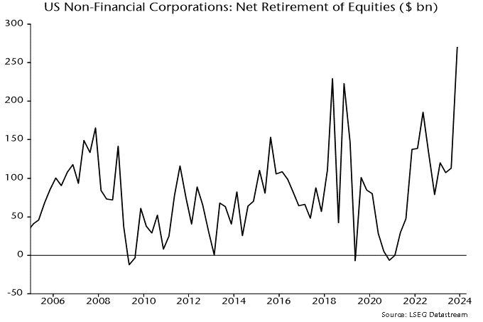
First, net retirement of equities by non-financial corporations (via buy-backs and cash take-overs) reached a record dollar amount ($270 billion) in Q4, confirming that corporate buying was a key driver of the year-end rally – see chart 1.
Chart 1
The rise in equity purchases followed strong growth of non-financial business broad money holdings in the year to end-Q3, discussed in a previous post. Such holdings, however, contracted slightly in Q4, pulling annual growth down from 10.6% to 6.2% – chart 2.
Chart 2
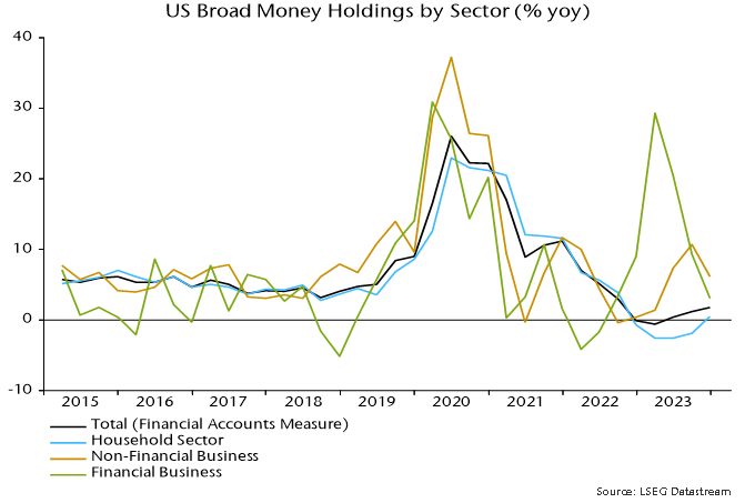
Financial business money holdings had surged in the year to end-Q1 2023, perhaps partly reflecting cash-raising related to equity market weakness in 2022. These balances were run down during H2, though still finished the year slightly higher than at end-2022.
The recent weaker trends in non-financial and financial business money suggest less buying support for equities and other risk assets going forward.
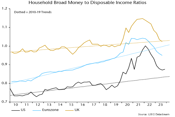
Household broad money, by contrast, rose solidly in Q4, resulting in the annual change returning to positive territory. The ratio of money holdings to disposable income recovered slightly following six consecutive quarterly declines, remaining above its pre-pandemic trend, in contrast to shortfalls for corresponding Eurozone and UK ratios – chart 3.
Chart 3
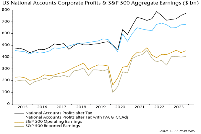
The Q4 financial accounts also contain initial estimates of corporate profits and gross domestic income (GDI). Profits after tax adjusted for stock appreciation and economic depreciation rose at a 2.5% annualised rate last quarter and remain below a peak reached in Q3 2022 – chart 4, blue line. The range-bound movement is consistent with S&P 500 earnings data and questions perceptions of economic / profits strength.
Chart 4
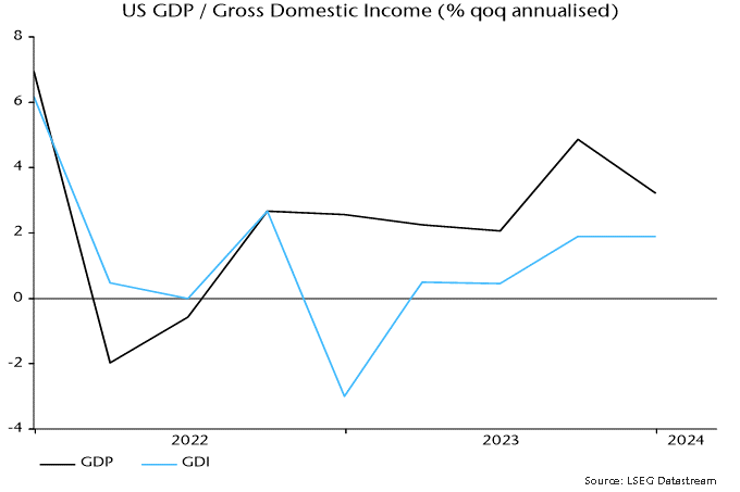
GDI is an alternative estimate of GDP and has consistently lagged the headline expenditure-based measure in recent quarters – see previous post. It did so again in Q4, rising at a 1.9% annualised rate versus headline GDP growth of 3.2% - chart 5. GDI grew by just 1.2% in the year to Q4.
Chart 5